Dog owners sometimes need help caring for and walking their dogs. They need a service to connect with trusted dog walkers. In addition to booking a service, dog owners need to trust that their dogs are in safe hands.

I relied on the cyclical UX design process to guide my efforts on producing this app:
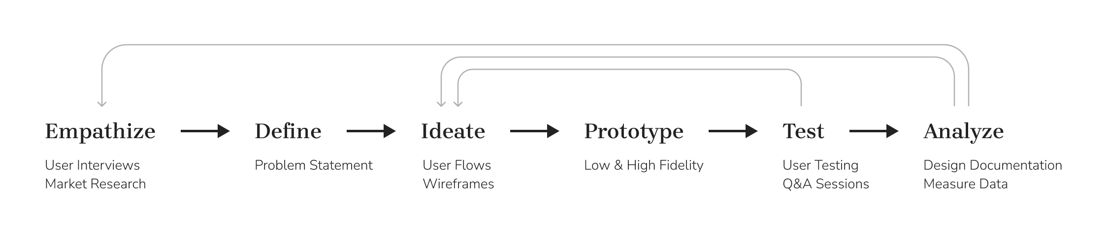
Research and group brainstorming sessions helped to clarify the user, their pain points, and project objectives.


After conducting multiple user interviews I learned that dog owners want to make sure service providers are aware of the dog’s unique needs like puppy training or social interaction with other dogs. Users expressed frustration with finding people that can be available at a certain time and concern over strangers being around their pets or in their home. Here's some quotes:
I found a sitter through the app, but now I just hire her directly and don’t use the app anymore.
— Anonymous dog walking app user
I’m more comfortable with having someone I know come to my house versus dropping her off at some one else [stranger].
— Anonymous dog owner
Lucy [dog] is a bitch. She doesn’t get along. She would get into a fight.
— Anonymous dog owner
An audit of existing apps helped to reveal some initial findings. I compared some of the screens for similarities and differences. I read strong and weak testimonials to deepen my understanding of users’ experiences.

The User Persona is a fusion of the individuals interviewed and market research. Meet Chet, a 28 year old sales professional. He needs to hire professionals in a short amount of time to watch his dog while he is traveling.

My user flow started with a focus on meeting the base requirements for booking an appointment. While the flow looks complicated it was simply organizing and order of operations. I was able to reduce the number of screens in after some work on wireframes and in testing.

This user flow was pretty complicated so I did what I could to simplify. While the revised diagram itself is similar—it uses less screens to get the user to their goal.

Wireframes were used to sketch out ideas for the onboarding and appointment booking flows. These are just a few of the wireframes showing the log in screen, home screen, search results, and user profile screens.


For the next round of wireframes I simply built up and refined ideas from the previous ones. The biggest differences were detailing what kind of content was in the cards, adding menu navigation, and leaning into a stronger visual hierarchy.
The visual design came together over a series of iterations. Building a prototype and testing it impacted some of the choices I made.
These three iterations of the home screen shows how the visual design became refined over time. Decisions were reduced to give the user a stronger interaction point. Less colors meant more impact for the interactive elements.

Here's a recording of how the user would create an account followed by an explanation of the different screens.


Here's a recording of how the user would would book a dog walking service followed by an explanation of the different screens.


It was user testing that revealed the home page was too cluttered and needed a stronger focal point to direct interaction.
Here—try the prototype yourself below, or you can try it directly in Figma.

The original user flow may have been closer to the end result than planned as it chunked out decisions into more manageable screens. As far as visual design goes I wanted to work from a range of colors, but realized I had too much going on that cluttered up the visual design.
I would like to give a special thank you to my UX Design mentor Benjamin Balderas and fellow students who assisted in this design process and provided feedback and support.