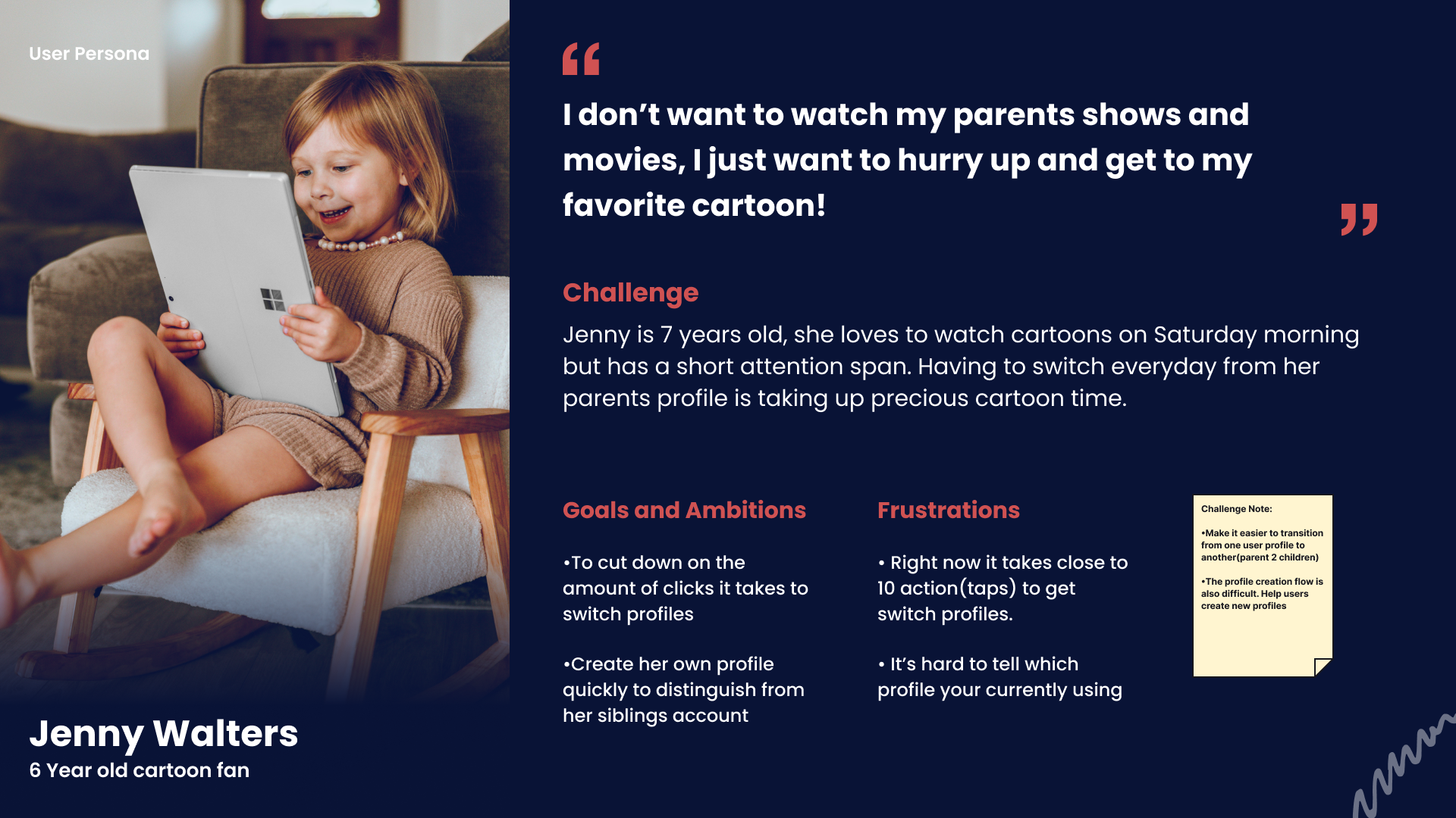
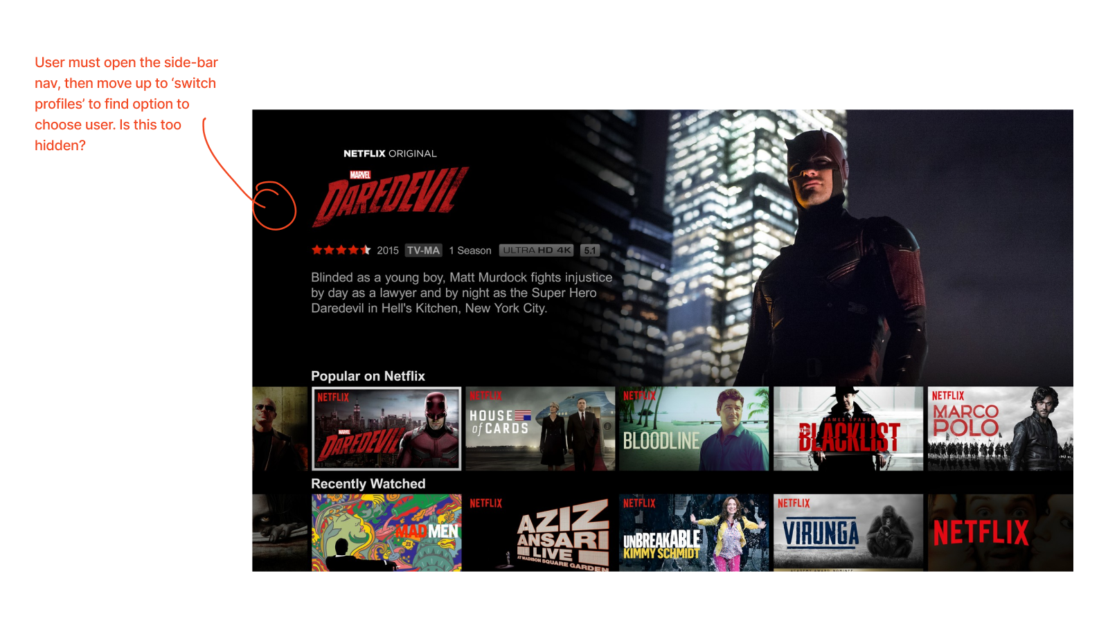
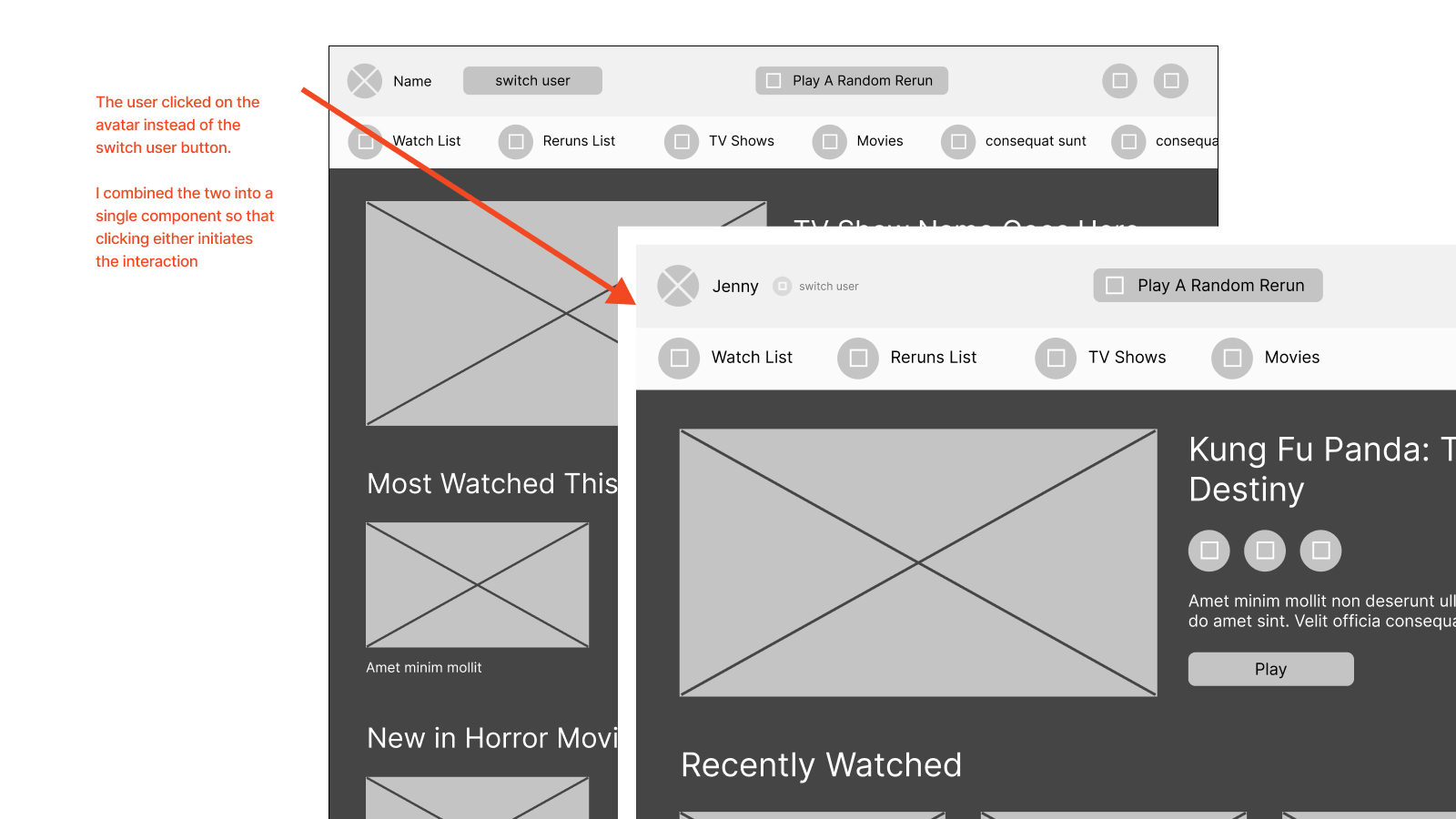
Younger users are having trouble transitioning from their parents' profiles to their own. Users as young as 4 have their own profiles so they can access family friendly content, but sometimes it takes more than 10-12 movements on their controller to get to a hidden profile switch screen.

Problem Severity & Risks: Parents will get frustrated and unsubscribe from the streaming service. The client will lose revenue if they are unable to solve this small problem. The client expects subscriptions will stop dropping from households with young children if the parents and kids have a smoother experience sharing the streaming service in the home.
Project Goals:
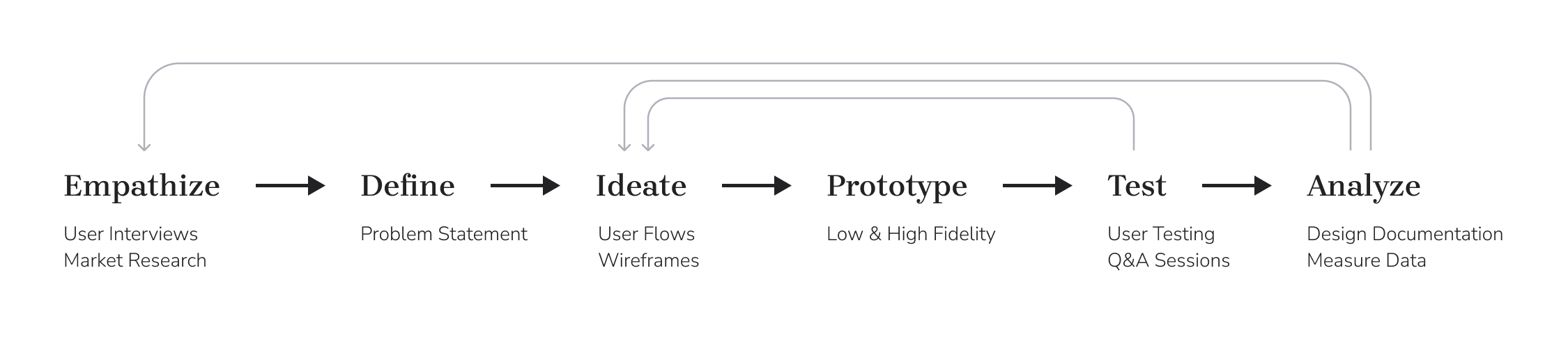
I relied on the cyclical UX design process to guide my efforts on producing this app:
When I began this project a bit of research was already available. I expanded research findings by doing a competitive audit.
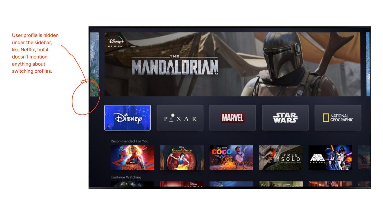
All signs point to younger users (ages 4-8) having a difficult time finding where the profile section lives in the application.
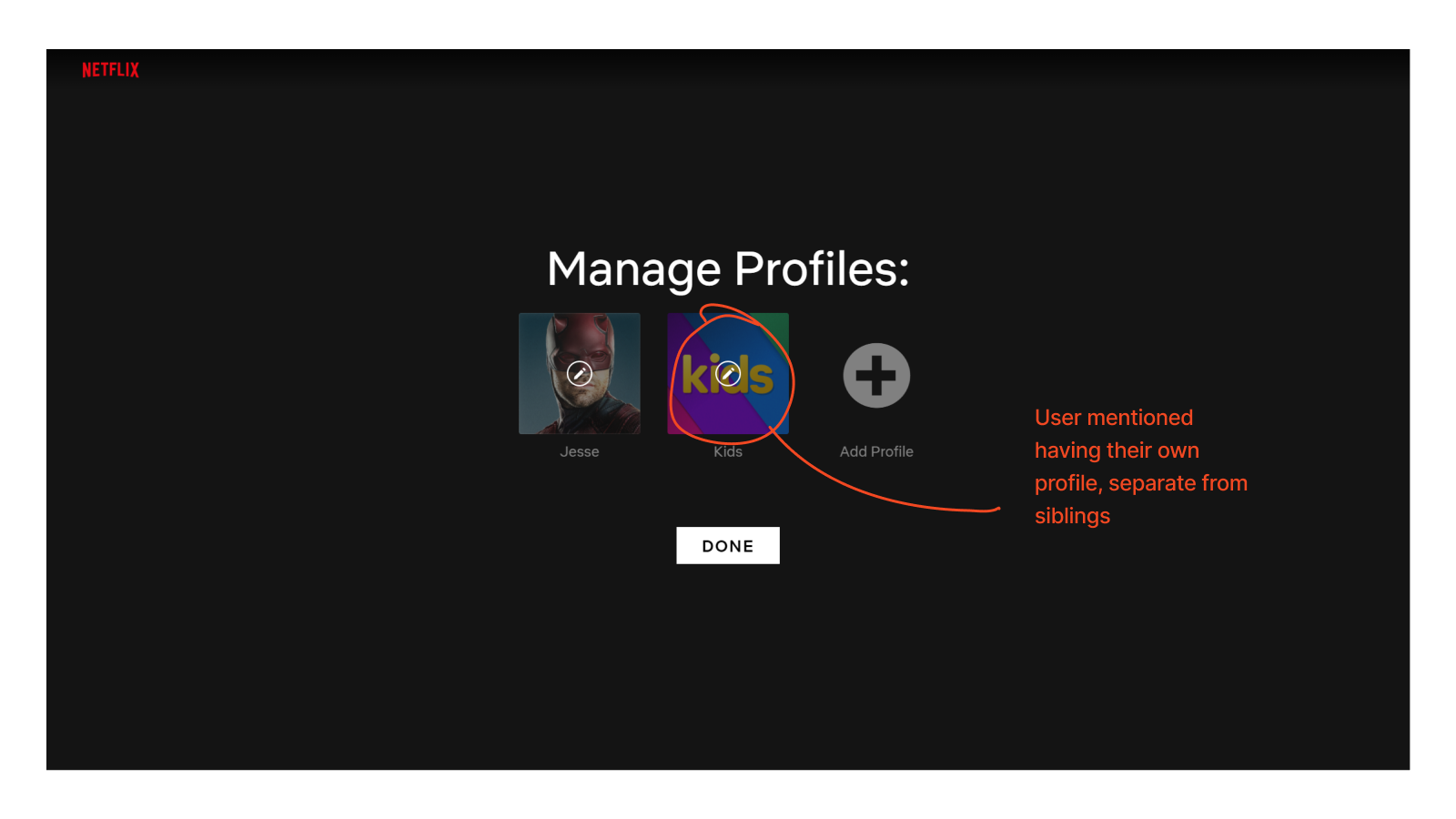
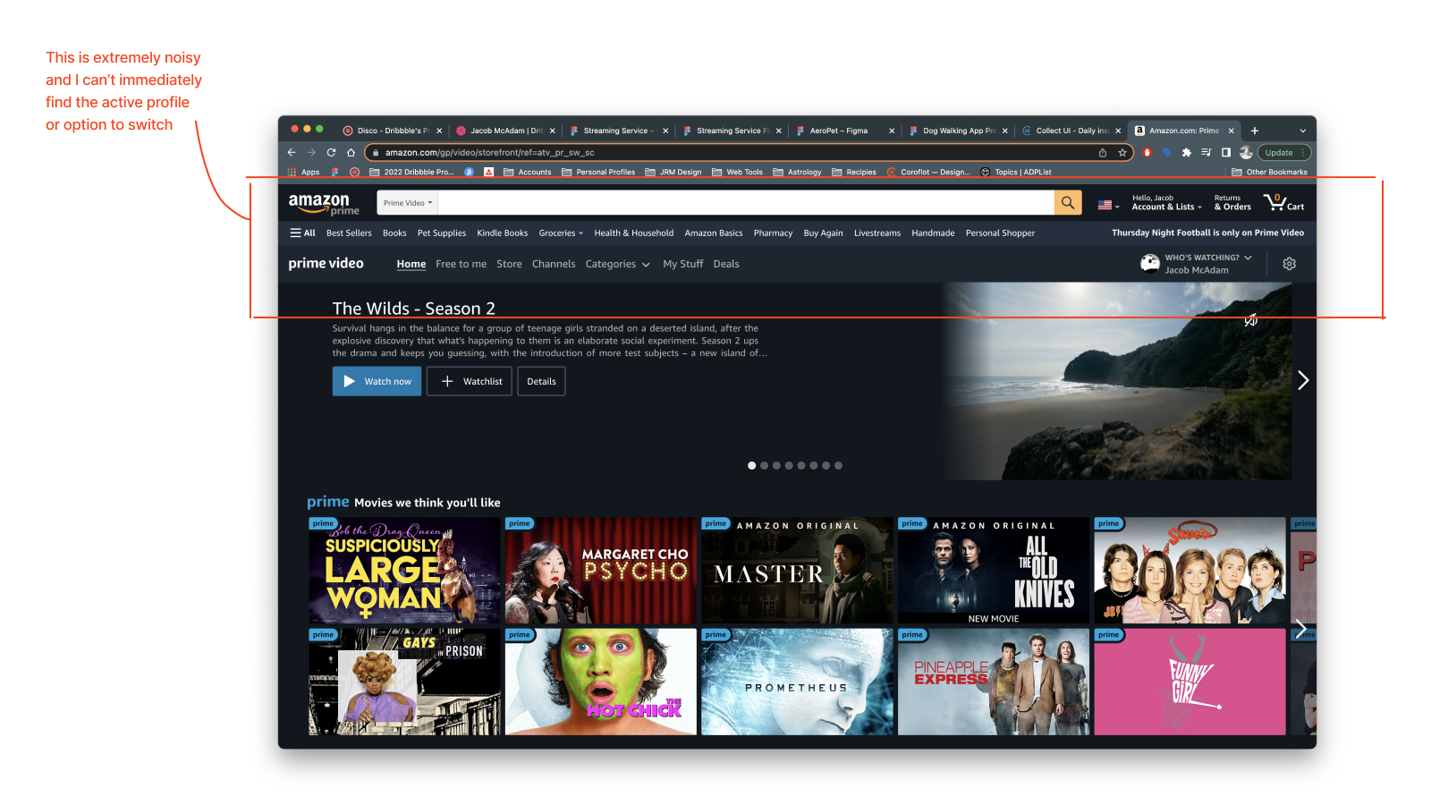
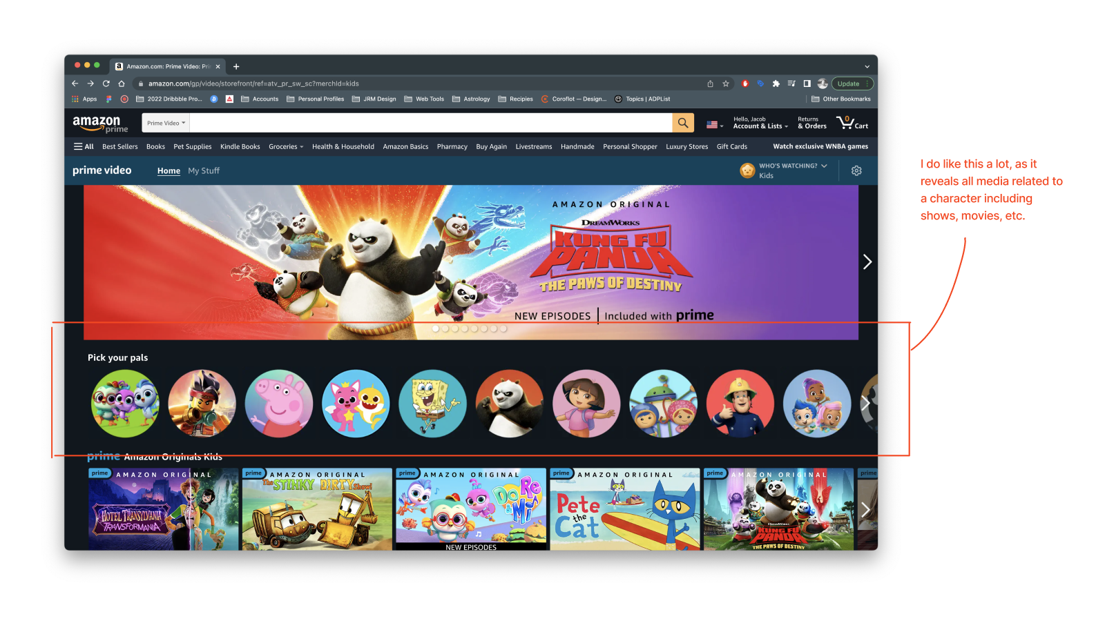
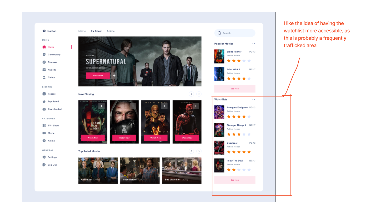
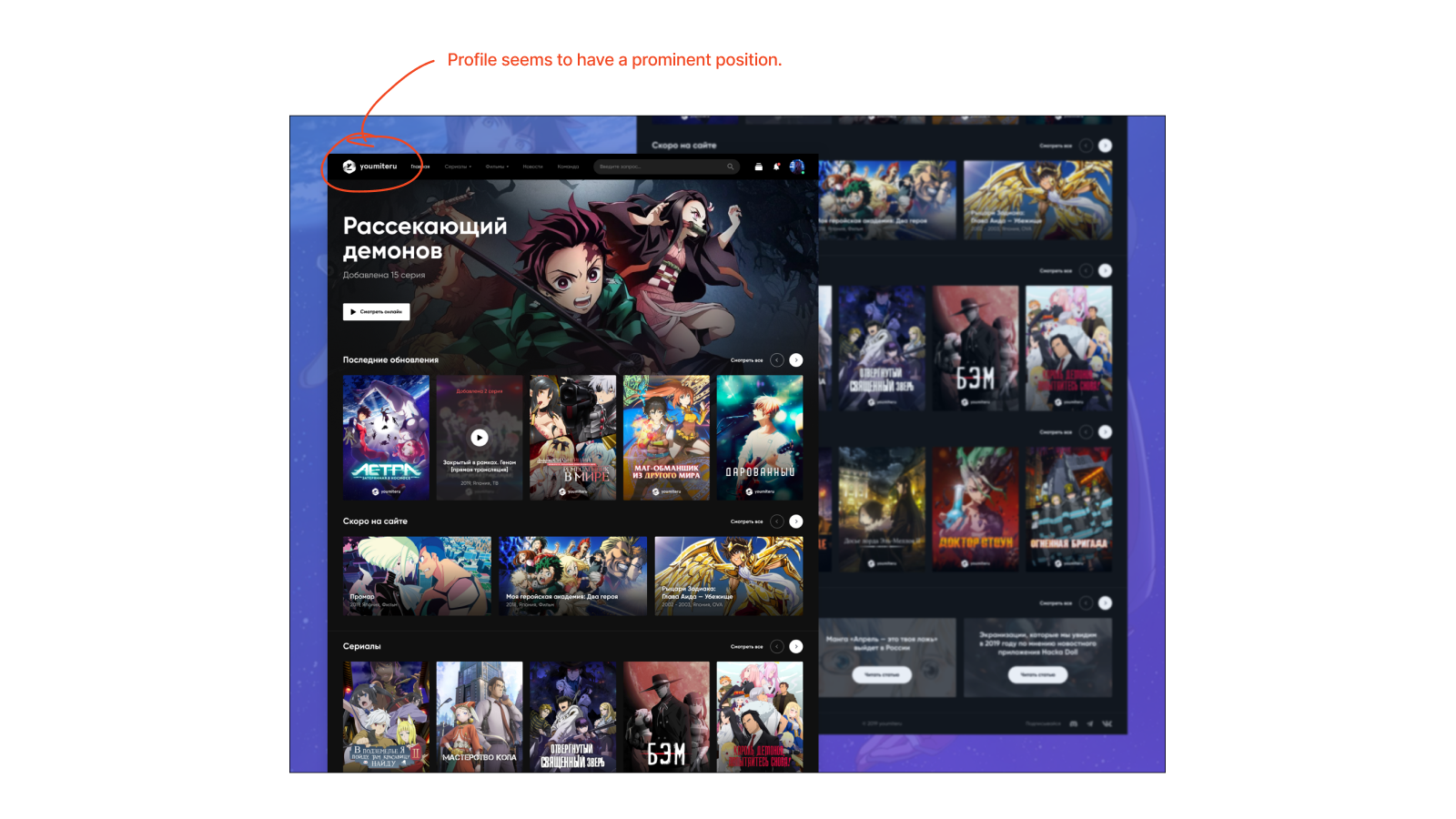
A competitive audit between Netflix, Amazon Prime Video, Disney+, and other UI inspiration helped to set some direction for wireframes.
User flows and wireframes helped to build out ideas early in the process. Before I moved into visual design I decided to do a user test to weed out any immediate issues.
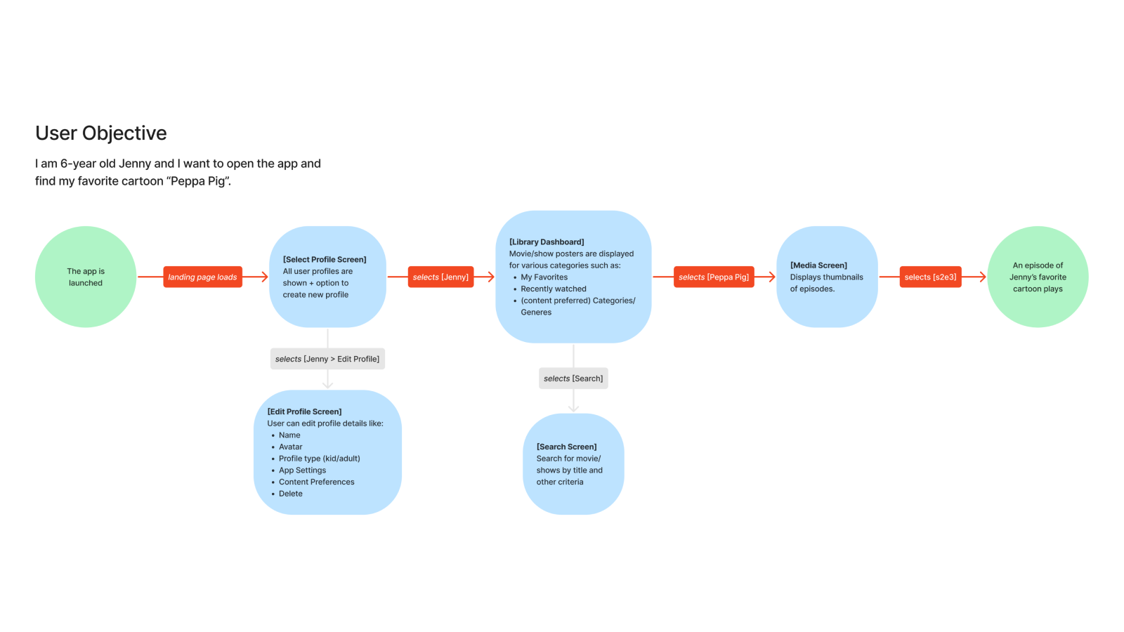
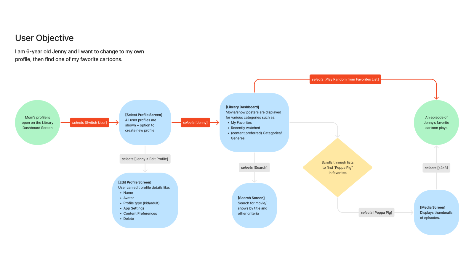
The first user flow starts from app launch which doesn't empathize with the user so I addressed that in the revision. The Red Route is identified within these flows, and the second flow gets the user to their goal in just 2 screens.
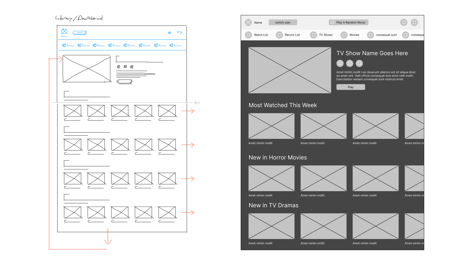
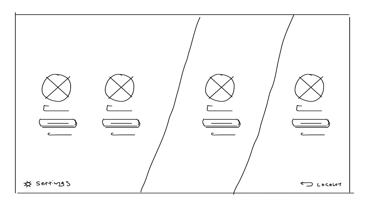
The wireframes started in my sketchbook, and were continued in Figma. I focused on the key screens identified in the revised user flow.
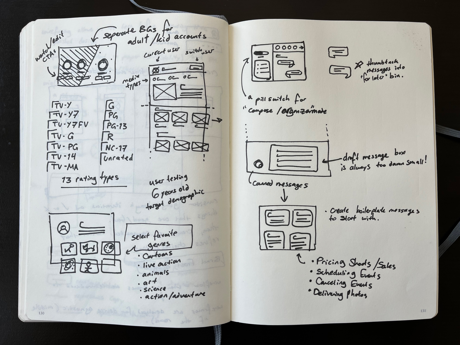
I prototyped and tested the wireframes early in the process so I could address issues ahead of visual design.
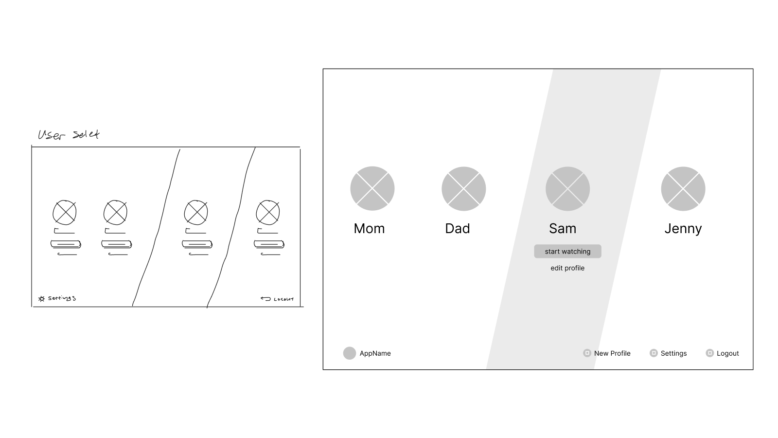
A wireflow test of the user select screen
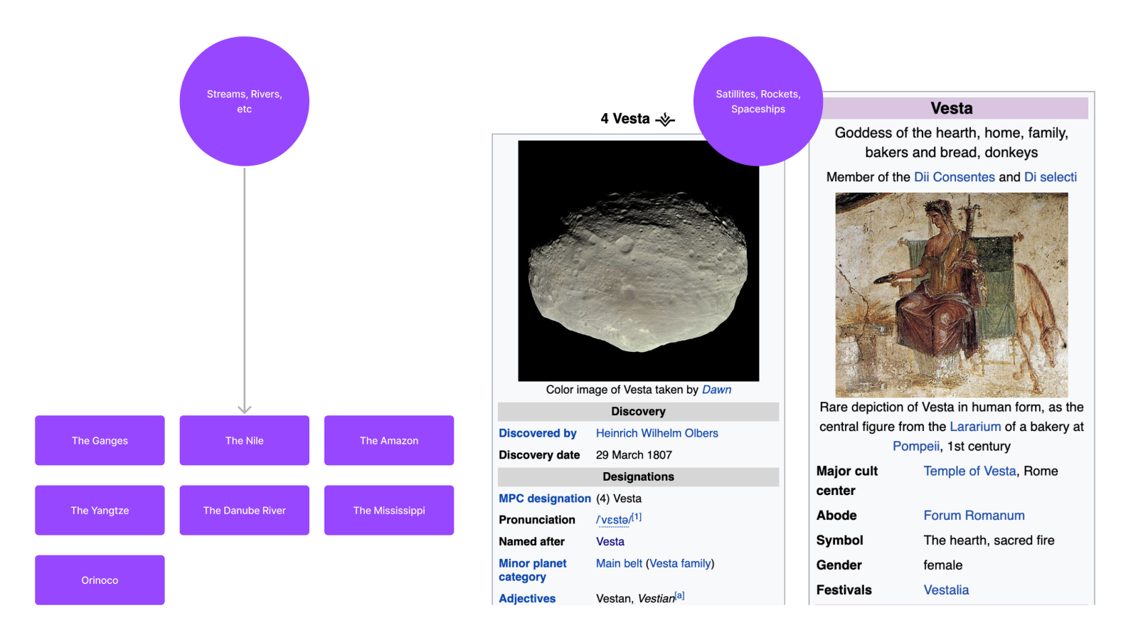
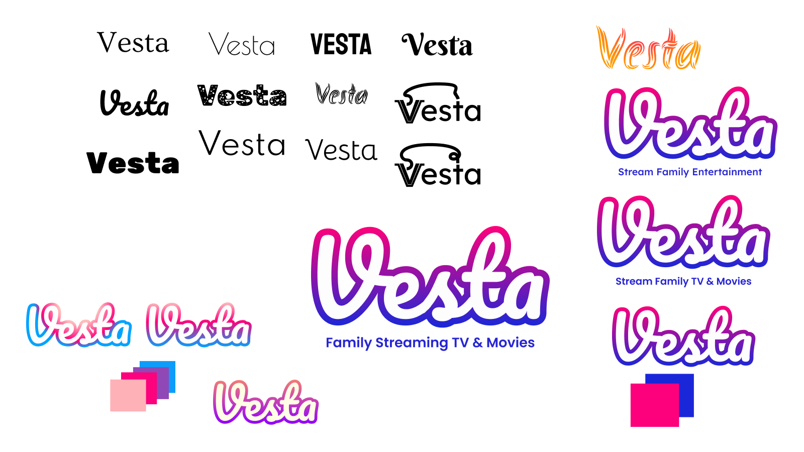
The visual design started with some light brand exploration for a centralized concept. I considered pulling ideas from literal streams and rivers, but decided space and satellites offered more visual material to work with.
The user persona is a child so this product should be family friendly and feel appropriate for a family home entertainment platform. I started with looking up heavenly bodies in space and found the mythical equivalent of Vesta is the Goddess of hearth, home, and family—so I felt this direction aligned.
A test user completed the flow within 00:01:13 (hh:mm:ss). Afterwards, they shared some thoughts about the interactive experience and visual design. Revisions were made to the prototype and a second user test was performed where the flow was completed in 00:00:21 (hh:mm:ss). Additional insights were shared after the second test was completed.
Here's a demo of the user flows and annotations to explain each screen. You can test the design yourself using the Figma prototype below.
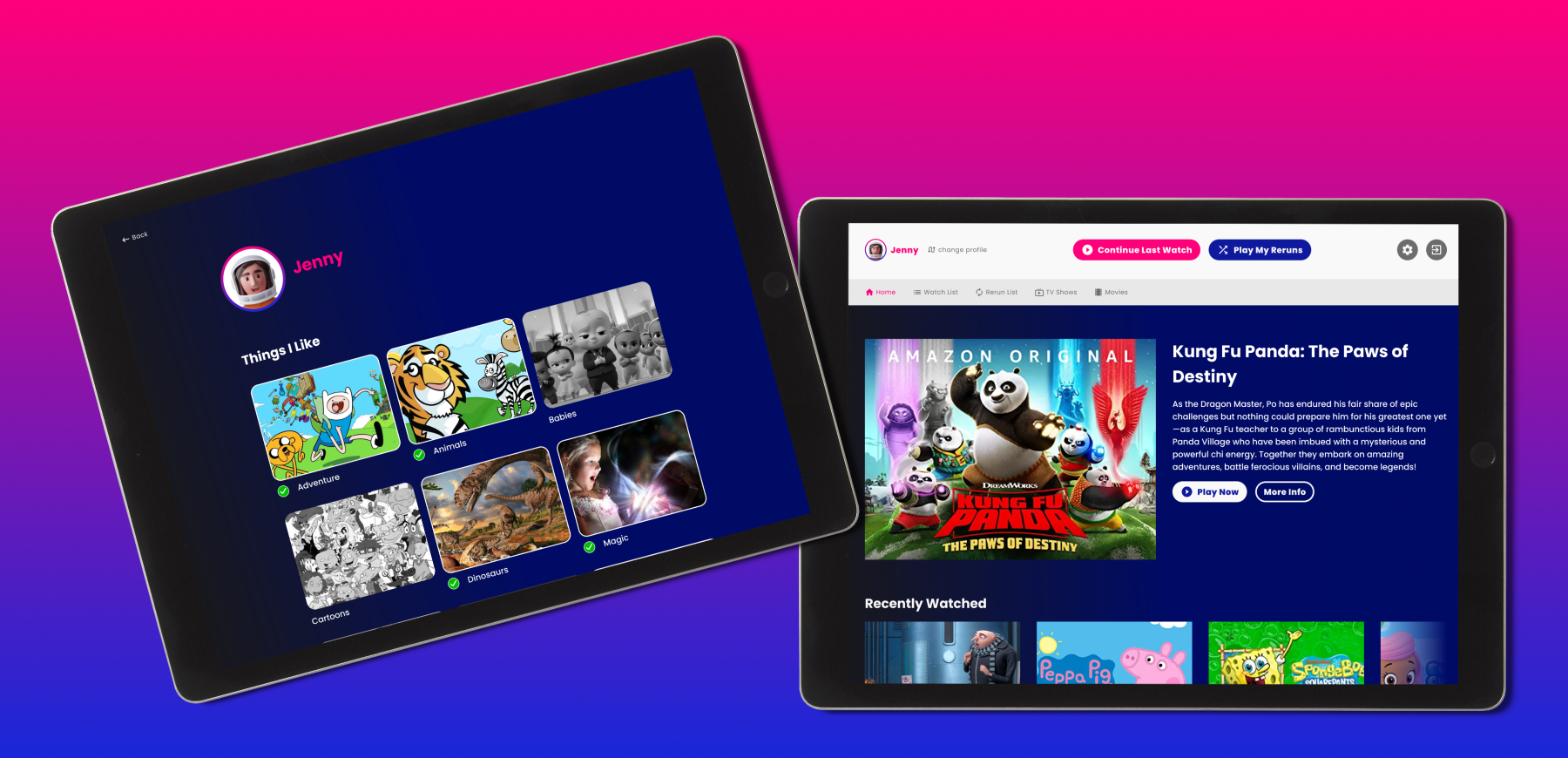
In this recording the user changes to their own profile, and then finds a video to play. An explanation of the screens follow.
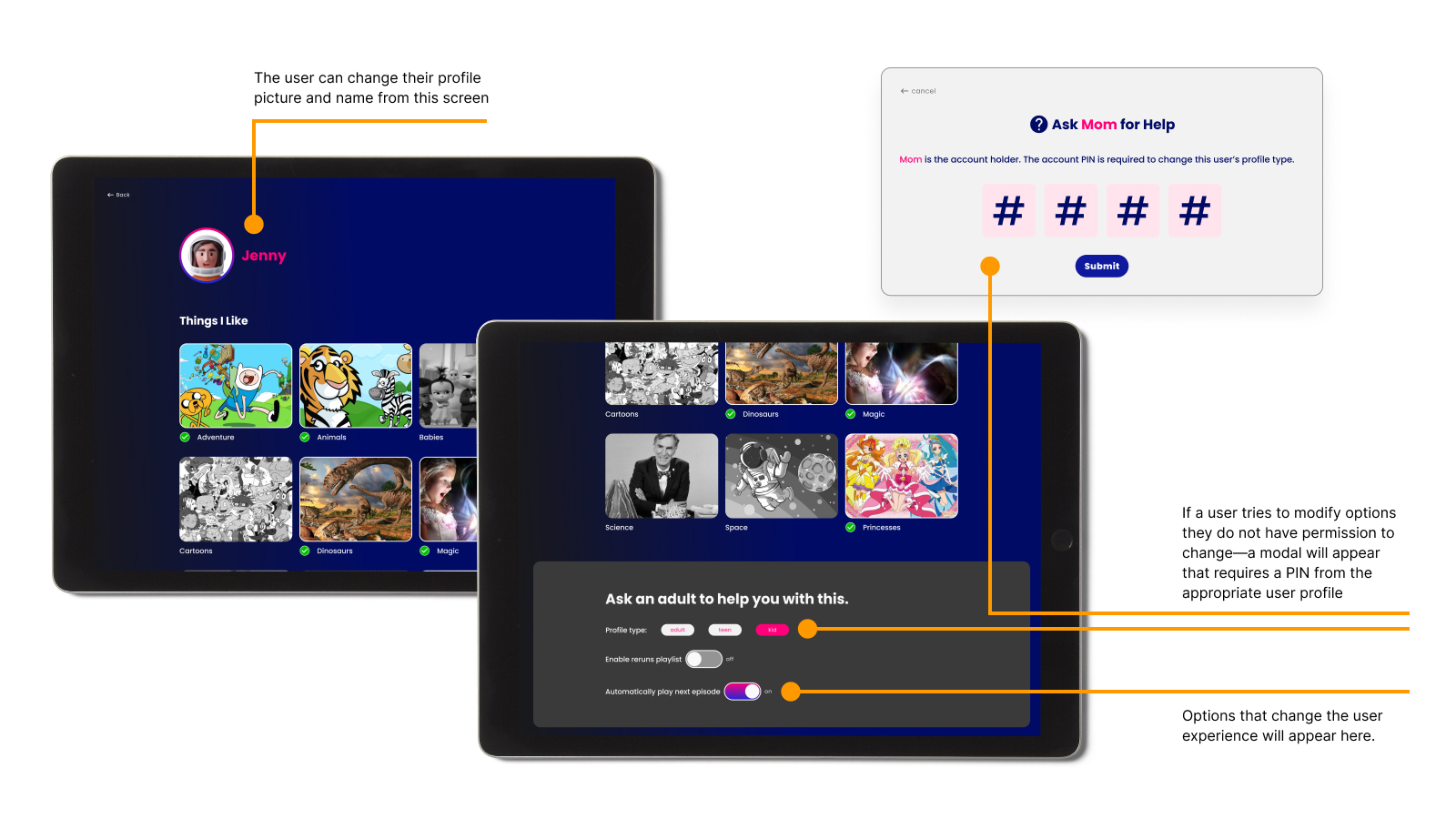
In this recording the user finds their profile and edits content preferences to be focused on cartoons. An explanation of the screens follow.
Try the prototype right here:
The following data helps to measure the success of this project and what the next steps to improve would be.
Users must be able to switch profiles within 6 actions from anywhere in the app
Satisfied, user actions reduced 66%. Users can access switch profiles option within 2 actions from anywhere in the app.
A confirmation screen that profiles have been switched is required
Partially satisfied, the switch profile screen mostly achieves this. Users confirm profile switch by pressing "start watching". Stakeholders might argue differently.
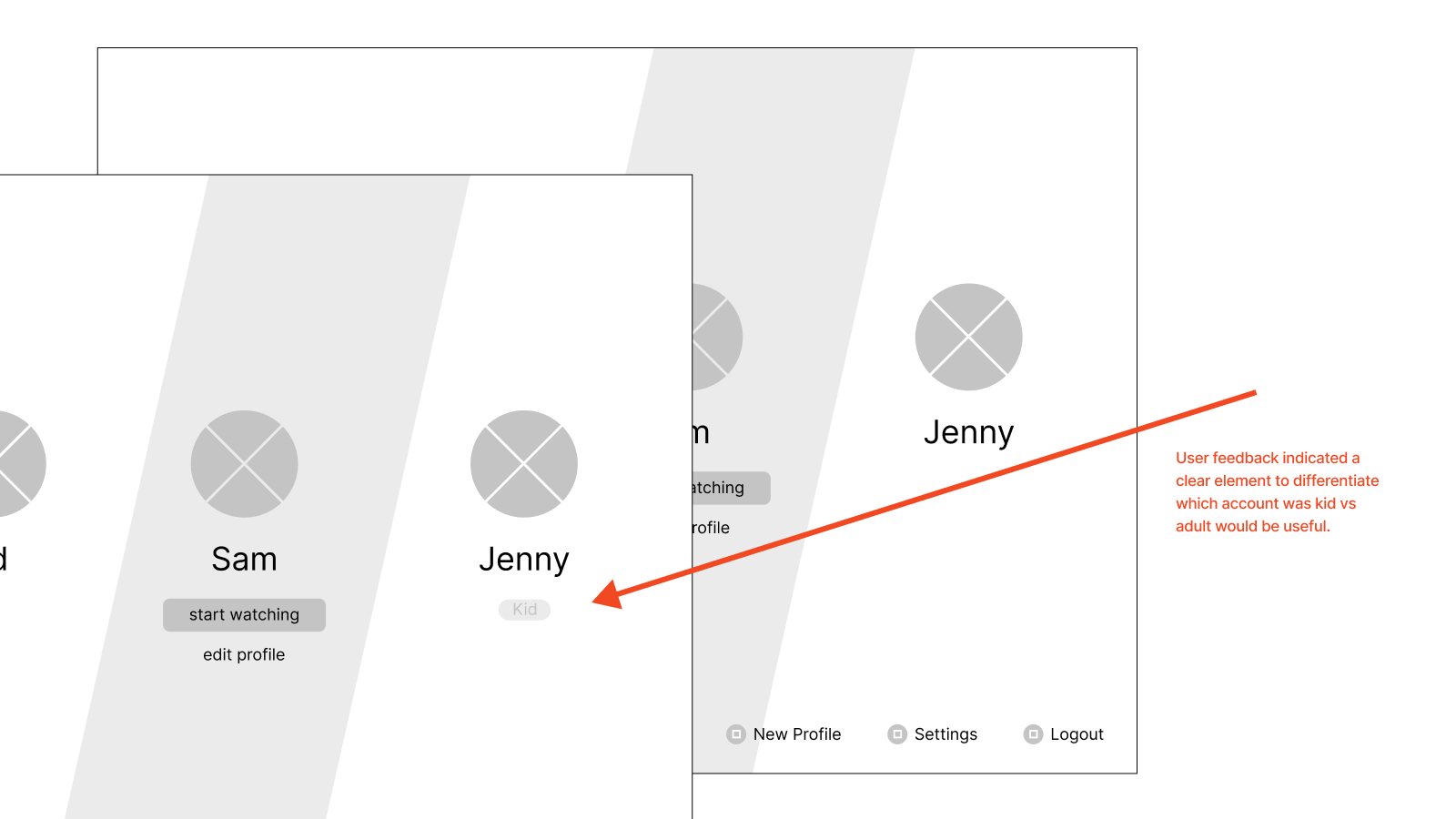
Also there must be a visual difference between the interface for adults and the interface for kids
Unsatisfied, the current version of this prototype doesn't have a visual difference in the interface for kids. While I might argue against needing this at all the client would likely be upset by this and it should be addressed.
Time for User Goal Completion Was Reduced 29%
By comparing user tests the goal was completed 52 seconds faster.
Test users were unrepresentative. Unfortunately I was unable to get access to my target demographic user (6-year old children) so I had an adult user perform this test. This might be the most critical part of user testing that remains unverified.
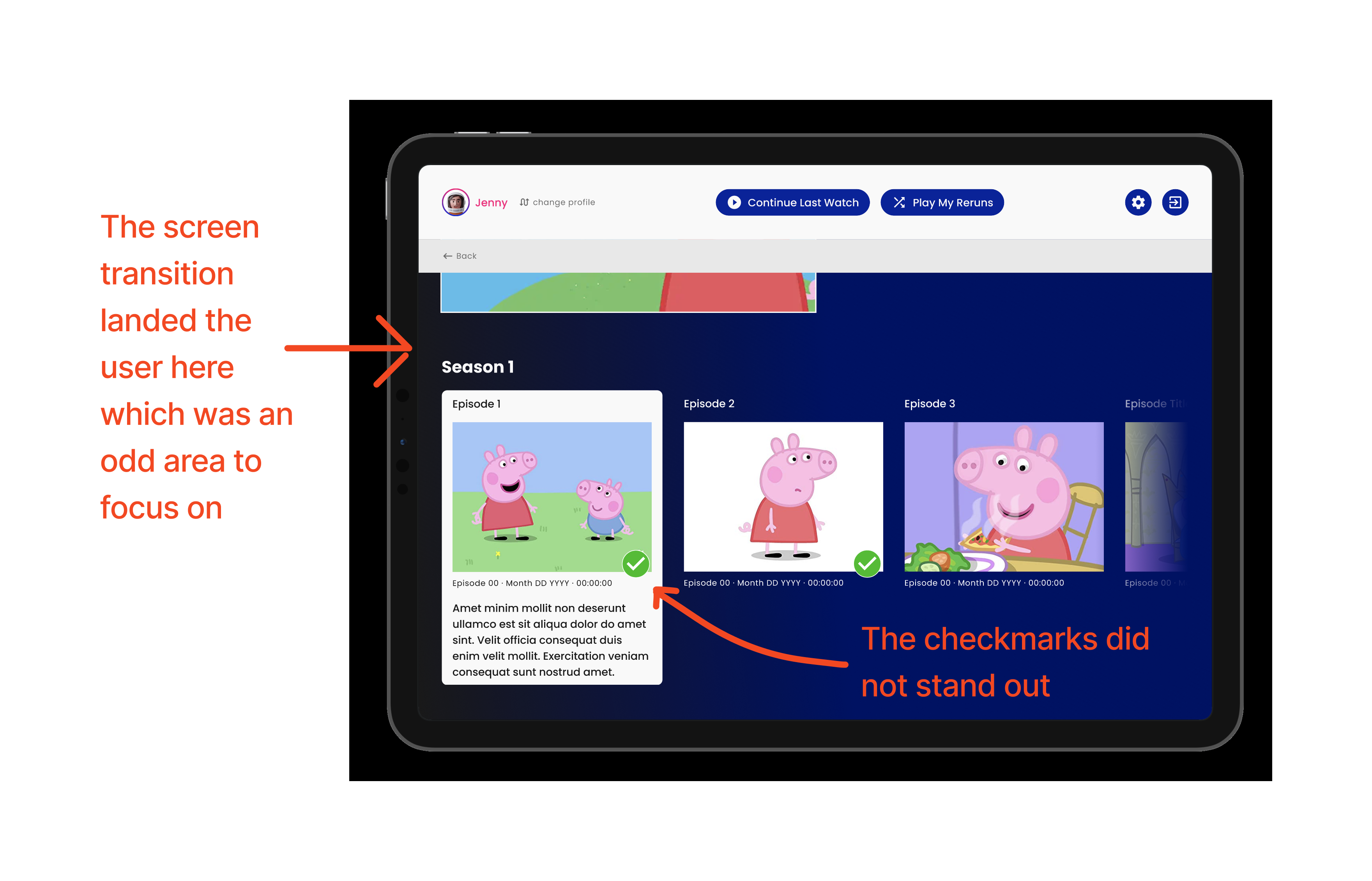
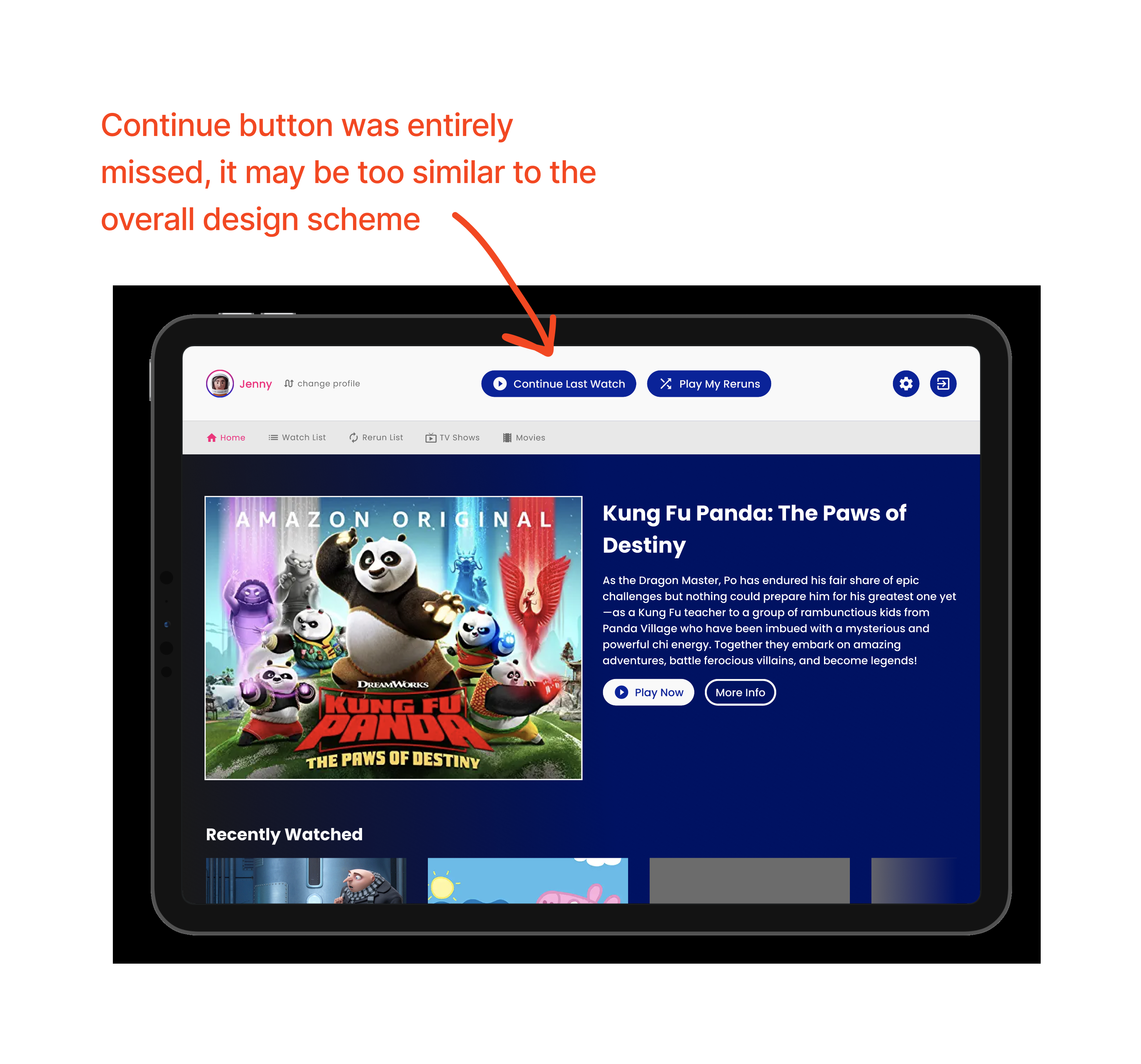
The "Continue Last Watch" button was missed by all test users. This button is not immediately clear what it might do so changing the UX copy to something like "Resume: Peppa Pig", where the previous title appears within the call to action is displayed.
I learned that each user has their own biases and ways of doing things. Over indexing on the way one user does something doesn't mean the design should necessarily be changed to support their experience. This suggests the importance of quality user testing where the base of users are well selected to be representative and account for some edge cases—if all the users are too similar it would skew data.
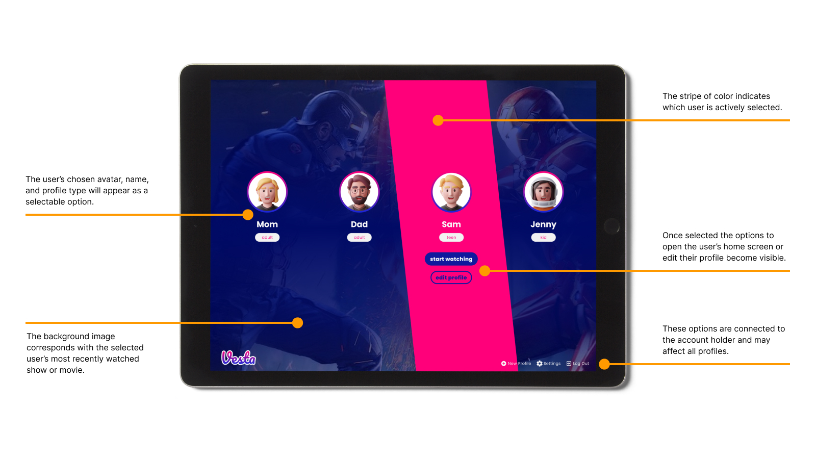
My personal favorite part of this design is the user select screen, and how the color stripe tumbles across!